Safe LivinG is an interactive experience designed to provide men, women, families and communities with comprehensive information on living securely. When you think about safety, there are an unlimited number of topics to touch. Safe LivinG touches on many topics, and the main focus is personal safety while you’re out in a public place, in your home, with your family and friends or alone.

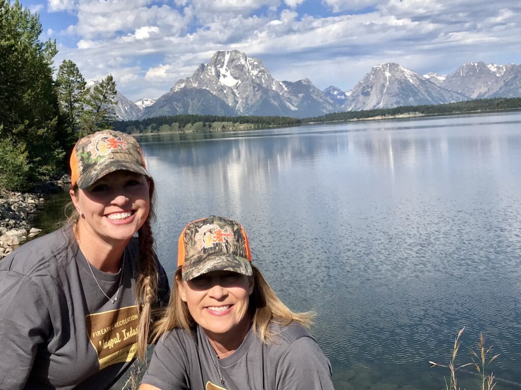
The logo for Safe LivinG is an abstract view of a picture Karen took of the Grand Teton Mountains.
This reflection is important when it comes to safety. The words, “Safe LivinG” are reflected in the abstract of the mountains. The “S”, “L”, and “G” are capitalized signifying the parent company, SLG2, Incorporated.

Safety, like the reflection of the Grand Teton Mountains, should always be part of our composition. It should never leave our side as a part of our daily routine. In everything we do, we should incorporate safety to live securely with Safe LivinG.”
Karen Butler, President/CEO SLG2, Inc
The color orange, is safety orange. It is bright and bold, and signifies to remember to be safe in everything we do. It is meant to be an invitation to all to experience Safe LivinG.

